In this chapter, we will focus on multivariate categorical data. Here, it is noteworthy that multivariate plot is not the same as multiple variable plot, where the former is used for analysis with multiple outcomes.
13.1 Barcharts
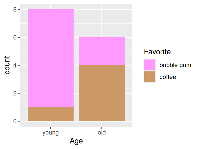
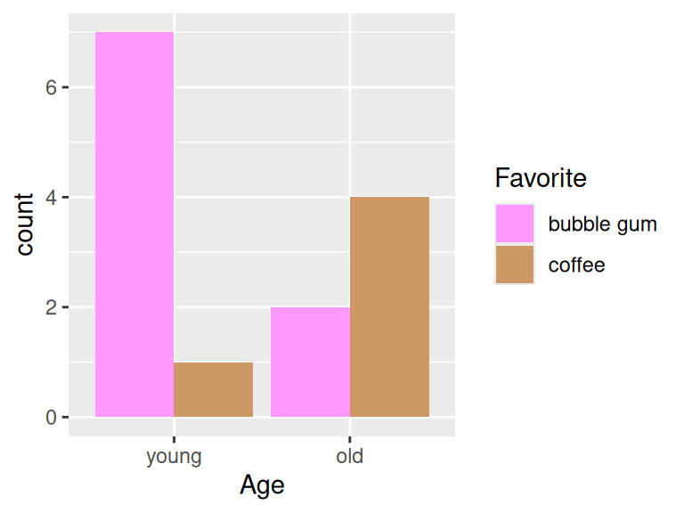
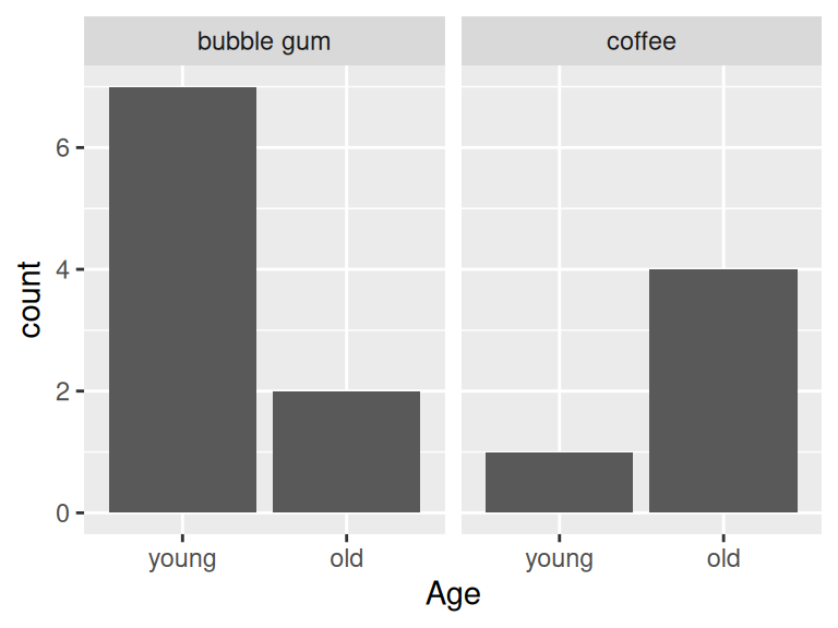
Bar chats are used to display the frequency of multidimensional categorical variables. In the next few plots you will be shown different kinds of bar charts.
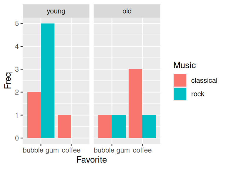
13.1.4 Grouped barchart with three categorical variables
counts3 <- cases |>group_by(Age, Favorite, Music) |>summarize(Freq =n()) |>ungroup() |>complete(Age, Favorite, Music, fill =list(Freq =0))ggplot(counts3, aes(x = Favorite, y = Freq, fill = Music)) +geom_col(position ="dodge") +facet_wrap(~Age)
13.2 Chi square test of independence
In this section, we would like to show how to use chi-square test to check the independence between two features.
We will use the following example to answer: Are older Americans more interested in local news than younger Americans? The dataset is collected from here.
We compare observed to expected and then the p-value tells that age and tendency are independent features. We are good to move on to next stage on mosaic plots.
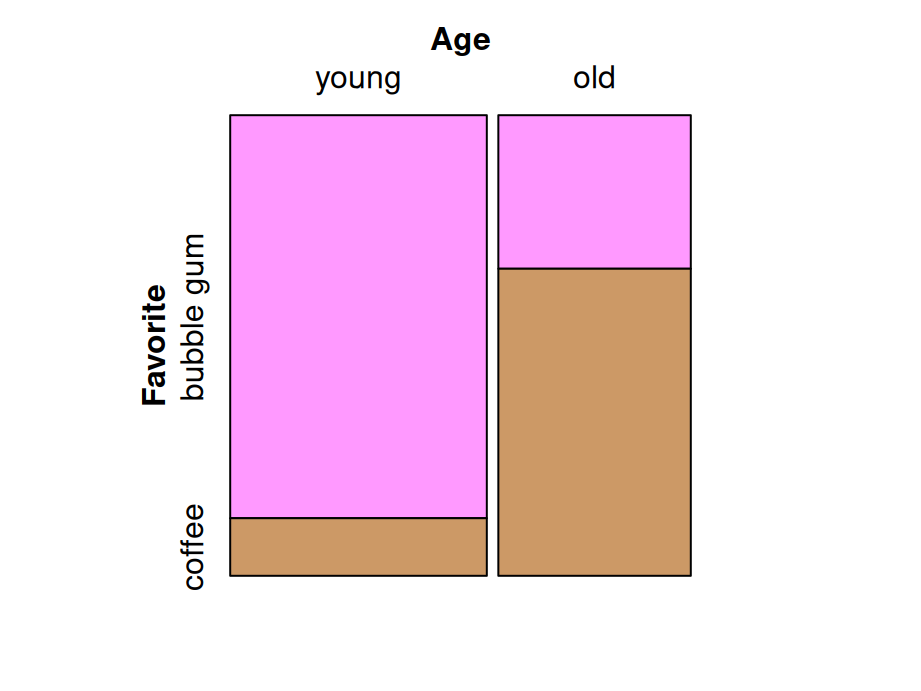
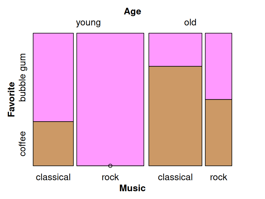
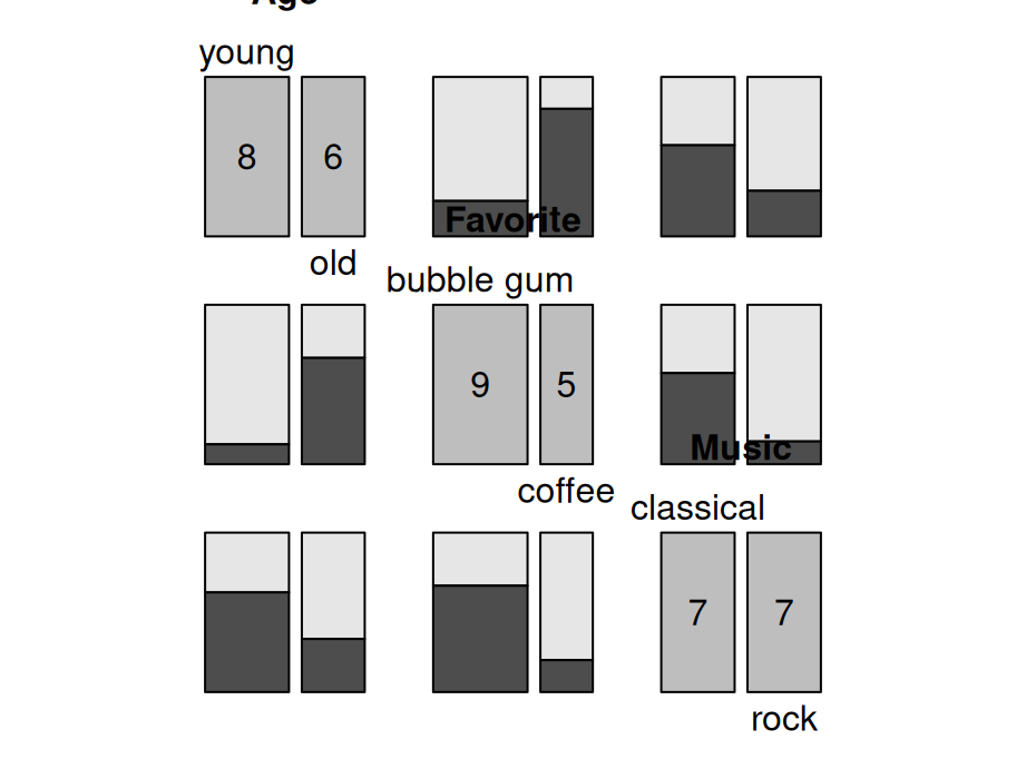
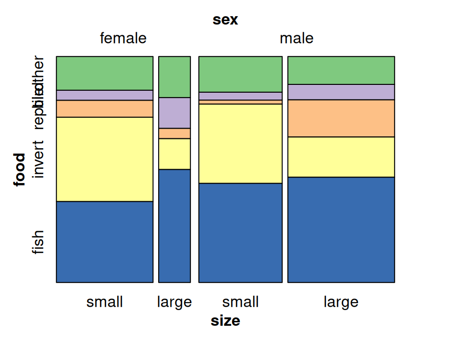
13.3 Mosaic plots
Mosaic plots are used for visualizing data from two or more qualitative variables to show their proportions or associations.
This type of chart works well with likert data, or any ordinal data with categories that span two opposing poles. The code below uses the likert() function from the HH package.
library(HH)gdata <-read_csv("data/gender.csv")HH::likert(Group~., gdata, positive.order =TRUE,col=likertColorBrewer(3, ReferenceZero =NULL,BrewerPaletteName ="BrBG"),main ="% saying the country __ when \n it comes to giving women equal rights with men",xlab ="percent", ylab ="")
13.5 Diverging stacked bar chart (with faceting)
Use | to condition (facet) on factor levels
gdata$Section <-c("Overall", "Gender", "Gender", "Party", "Party")gdata <- gdata |> dplyr::select(Section, Group, everything())# sort facets manuallygdata <- gdata |>mutate(Section =factor(Section,levels =c("Party", "Gender", "Overall")))likert(Group ~ . | Section,data = gdata,scales =list(y =list(relation ="free")), # equivalent to scales = "free_y"layout =c(1, 3), # controls position of subplotspositive.order =TRUE,col=likertColorBrewer(3, ReferenceZero =NULL,BrewerPaletteName ="BrBG"),main ="% saying the country __ when \n it comes to giving women equal rights with men", xlab ="percent",ylab =NULL)
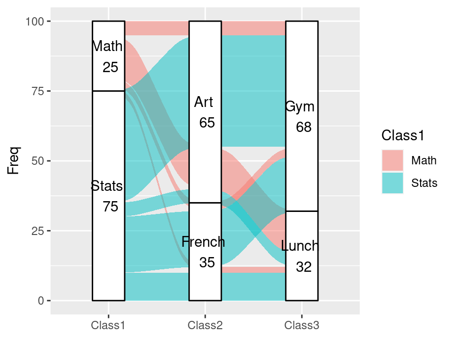
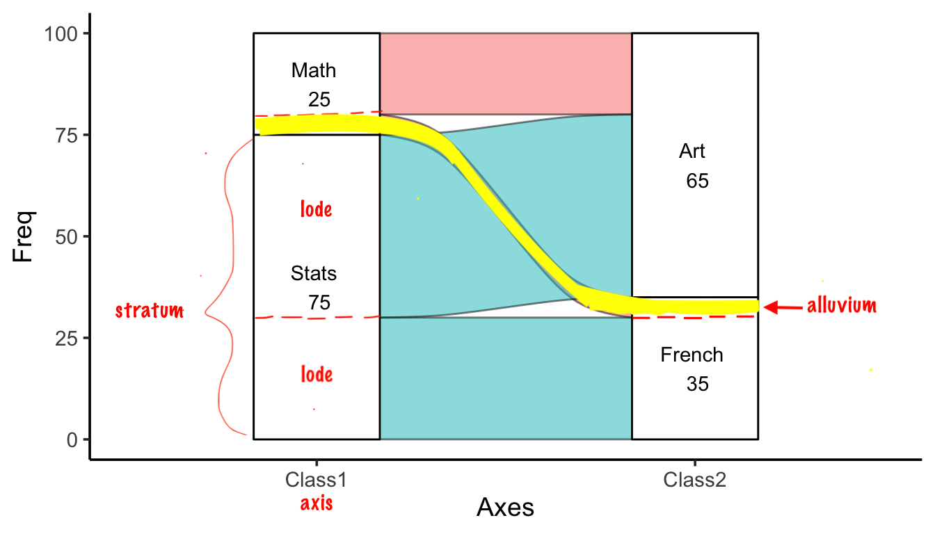
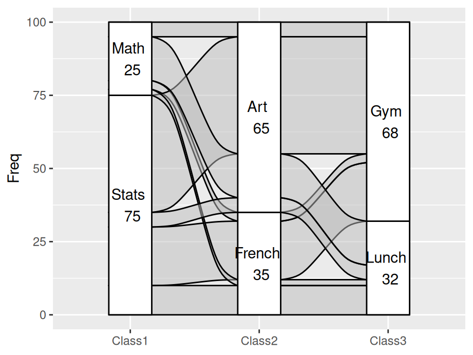
After we use geom_flow, all Math students learning Art came together, which is also the same as Stats students. It makes the graph much clearer than geom_alluvium since there is less cross alluviums between each axises.
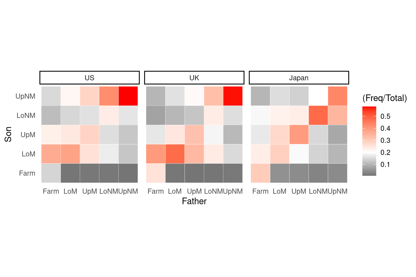
13.7 Heat map
Besides what have been systematically introduced in Chapter 9.2 Heatmaps, this part demonstrated a special case of heat map when both x and y are categorical. Here the heat map can been seen as a clustered bar chart and a pre-defined theme is used to show the dense more clearly.